How Humans ‘Read’ a Website
Even with the average adult attention span of 8 seconds, humans, like most other animals optimise their actions to get the best result for the least amount of effort.
So why would it be any different for navigating online?
It’s very easy for Graphic or Web Designers to fall into the trap of assuming they know how the end user will interact with their website.
In reality, users don’t normally behave the way you want them to and probably won’t spend as much time on your website and webpages as you expect when you create them.
It’s essential to understand how users think, what their basic patterns of behaviour are and how users interact with websites.
It will inform your decisions when structuring your information and website in a way where users can efficiently find what they’re looking for, you can steer them towards the information you want them to see and you can improve their retention of information.
So, how exactly do Users ‘Read’ a Website?
Steve Krug, a User Experience (UX) professional, has laid out 3 main ‘Truths’ about how People ‘Process’ information online.
- We Don’t Read, We Scan
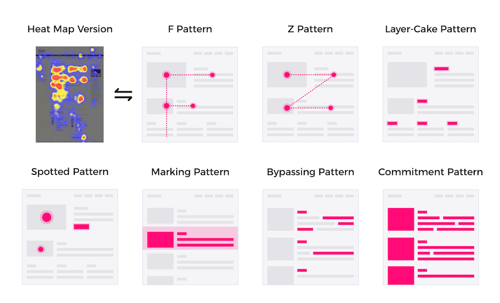
With very few exceptions, scanning is our primary mode of searching for information.In our current “Technological age” where our attention is regularly split multiple ways, we are all quite motivated by the desire to save as much of our time as possible.We read only what is strictly necessary to get the information and results that we want, using fixed points and key words and phrases on the site to get there.Those keywords and phrases are either:
a) Applicable to our current task
b) Relevant to our ongoing personal interests
c) Trigger words e.g. “FREE”, “SALE” etc.This image below from the Nielsen Norman Group, shows various methods of scanning a webpage.
- We Don’t Optimise, We Satisfice
Satisficing (a combination of “Satisfying” and “Sufficing”) is a decision making process in which people choose an option that is ‘good enough’ (reasonable) rather than the best.Most users won’t do thorough research, as we reason that Optimizing is hard, and takes a long time, Satisficing on the other hand, is more ‘efficient’.You are more likely to click a heading or link that sounds close to what you are trying to find rather than searching for an exact match.While online, there really isn’t much of an incentive to actually choose the best option, especially when you can just start again using the Back button!
- We Make Do
During Usability Testing, it becomes very clear that a significant amount of internet users operate with either incorrect notions or little understanding of how things work.The majority of us don’t find it particularly important to fully understand exactly how things work as long as we can still use them.
Fortunately, most of the time it works out!
We find a method that works for us and don’t change it unless we happen to encounter something better.
How can we Encourage Visitors to your Website to Stay Longer and Read your Information?
- Create a Clear Visual ‘Hierarchy’
The more important the information, the more prominent it should be.
Using headings, colour, bold or underlined text and negative space etc can make your content/information accessible to the most amount of people. This ‘pre-processes’ the information for us.
- Break-Up Your Webpages
It was brought to light that, during initial eye tracking studies of Webpages, people are quick to spot areas that may have useful information, and after finding it will hardly look at anything else.
Use high quality, optimised images, formatting and keywords/phrases can work wonders!
- Show What’s Clickable
This point is self explanatory, you should make it easy for people to find what is clickable on your website.Bolding and/or underlining text, using common phrases (“Click here”, “More Information”, “Read More”), creating a Button or including a Symbol (e.g. arrow) makes it obvious what your users can actually click on.Ensure however you choose to show this is consistent across your site and writing!
- Reduce Visual “Noise”
Visual noise can mean, actually graphics, writing and or elements of a webpage.
Every user has a different tolerance for distractions, so it’s in your best interest to assume most things can contribute to the visual noise.Keep your pages clean and as easy to navigate as best you can.
So to summarise:
- Users usually only scan web pages, using fixed points on them to steer them through the content.
- Users want ‘instant gratification’, they want to find what they’re looking for with the least amount of effort possible.
- Users will most likely choose the first option that they think will lead them to what they’re searching for.
Website Functionality and quality Content that is concise, well-formatted and includes your relevant keywords above all else, can determine the success or failure of a website.
For some additonal reading on this topic the Nielsen Norman Group, World Leaders in Research-Based User Experience have great information and articles, including this one.
This article, written on Medium.com tells you more about how user reading patterns influences web content design.
