WordPress Slider Case Study: Live Wire Sculptures
Recently, I was lucky enough to be able to help my uncle, Alan Holley with his website, Live Wire Sculptures.
He creates beautiful recycled sculptures, using armature wire, in combination with natural materials including wood, granite and moss that he finds around his bush property, down the south coast of Australia.
How to fix images in a Slider
This site was mostly created as a portfolio of some of his sculptural works
There were a few changes requested:
- Edit the images displayed in the slider
- Edit any images not properly oriented
- Edit any images not web optimised
- Change the appearance of the thumbnails underneath the slider
- Edit the images displayed in the slider
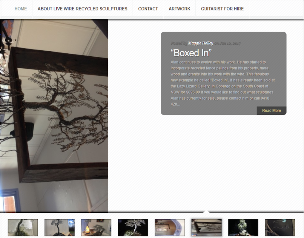
This is how it looked (below) before I made the changes:
As you can see, the images featured in the slider navigation have a description box that take up approximately half the slide and the image needed work!
He asked for a simple fix using the images that we already had, so once we discussed his idea of what he wanted it to look like, I started work.
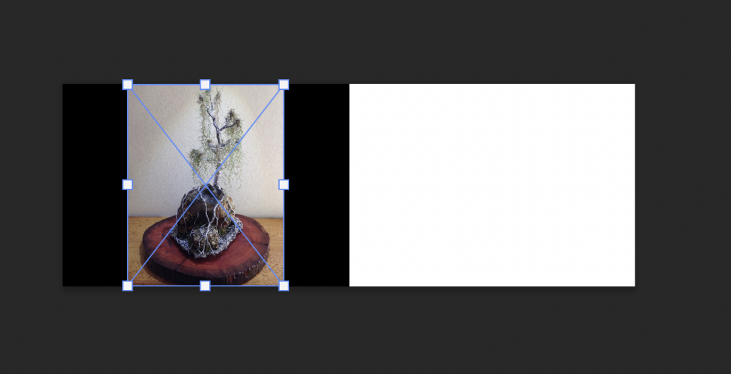
I downloaded the images displayed in that slider from his WordPress websites Media Library and then found the correct dimensions for the slider, which was 960px x 340px.
A custom canvas was created in Adobe Photoshop with the above dimensions (960px X 340px), once that was done, I added a 480px X 340px rectangle in black, so I had a half black, half white blank canvas.
The black was to accentuate the photo of the sculpture – and the white to make it easier for visitors to read the “featured description” next to the photo.
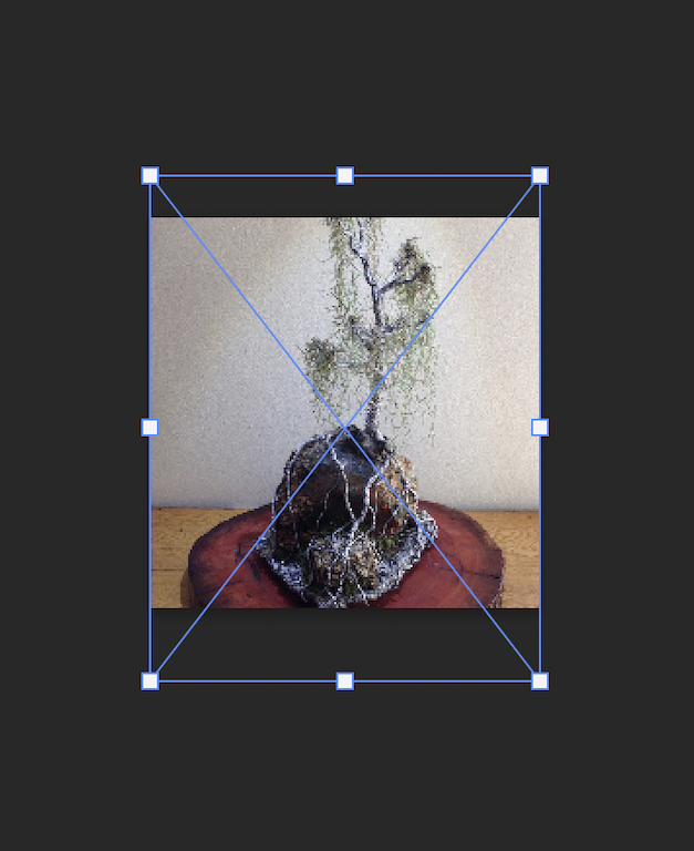
To complete the new thumbnails, I needed to find/verify their correct sizing on WordPress, which was 100px X 100px.
I made a 100px X 100px custom canvas in Adobe and dragged and dropped the images and scaled them to fit.
All of the edited and optimised images were exported from Photoshop and saved high quality JPEG’s.
Then they were compressed and emailed to my Uncle for his feedback.
He signed off on all but 2 of the images, which I changed per his request.
The new Slider images and thumbnails were uploaded into the WordPress ‘Media Library’, with their Titles and Alt Text (alternate text) descriptions, including the relevant keywords.
Unfortunately, once I got into the WordPress admin area, I noticed that his site was using an older, discontinued theme, which made altering the coding to change the thumbnail display size harder- but we wanted to retain this Theme.
With the help of wonderful coding wiz, Mr. H, we were able to identify the problem and input the new, correct coding for the specific theme, to alter the thumb size.
Once I reacquainted myself with the posts shown on the Home page slider, I opened each post one by one and removed the current Featured image.
Scrolling down past that to the Custom Fields (near the bottom of the Post Editor) is where I insert the new URL for the Featured Slider Image and under a newly created field (which I named “Small”) I pasted the new thumbnail URL as well.
This is one example of the new slider images(below) with the thumbnails underneath, also resized from the 95px X 54px to 100px X 100px displayed on the Home page:
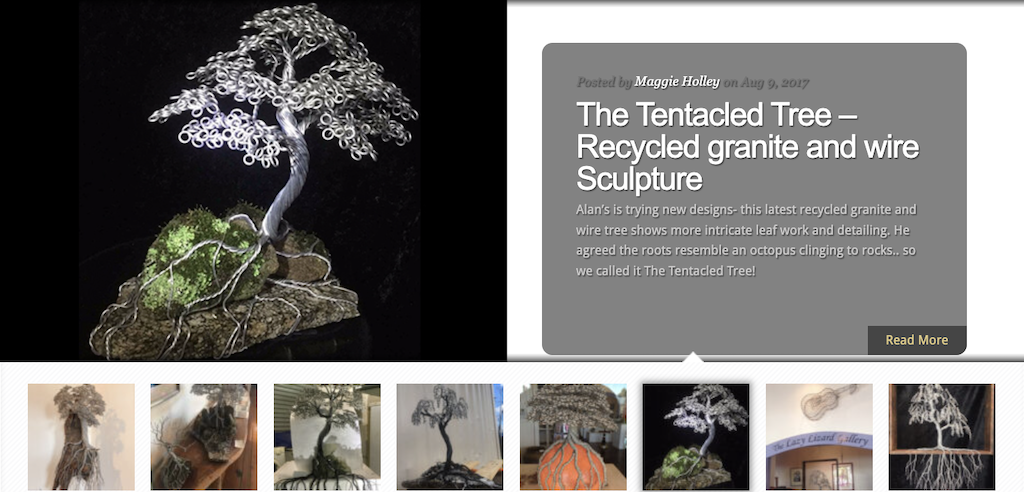
Here is how the new post thumbnails look in the artwork category: Properly oriented, framed and
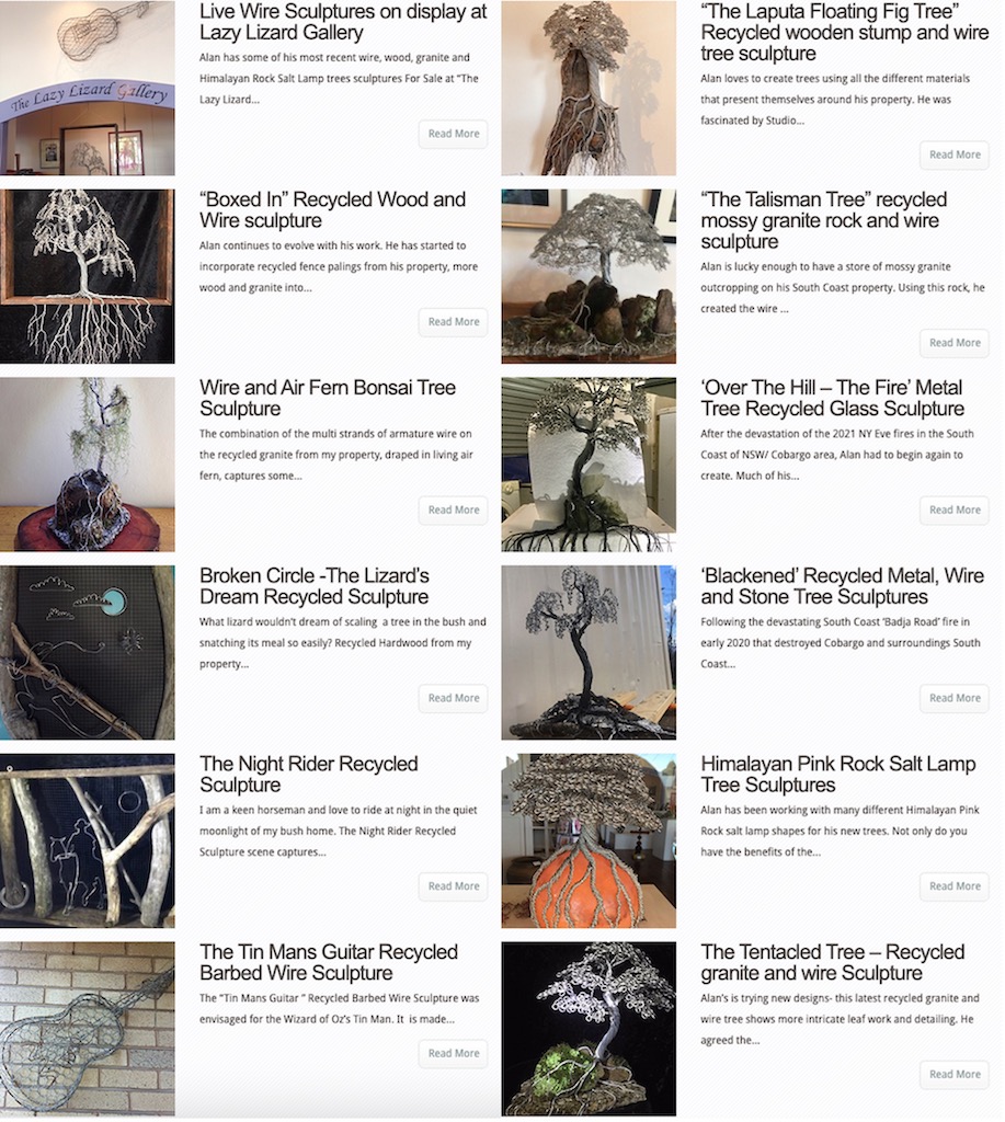
Both my Uncle and I were very happy with how it turned out.
We completed the simple fix he wanted using only his existing images, but managed to frame them in a much nicer way, which most times, makes all the difference!
Contact me if YOU need help with your WordPress site or graphics!


